Here are two case studies. Please reach out if you’d like to know more about a specific project.
︎ Toyota Racing
︎ Medio: Covid-19 Tracker*

Medio: Covid-19 Tracker
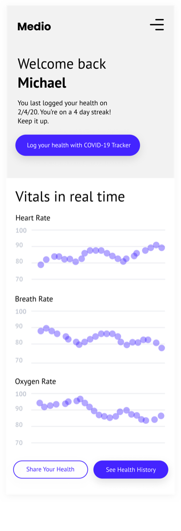
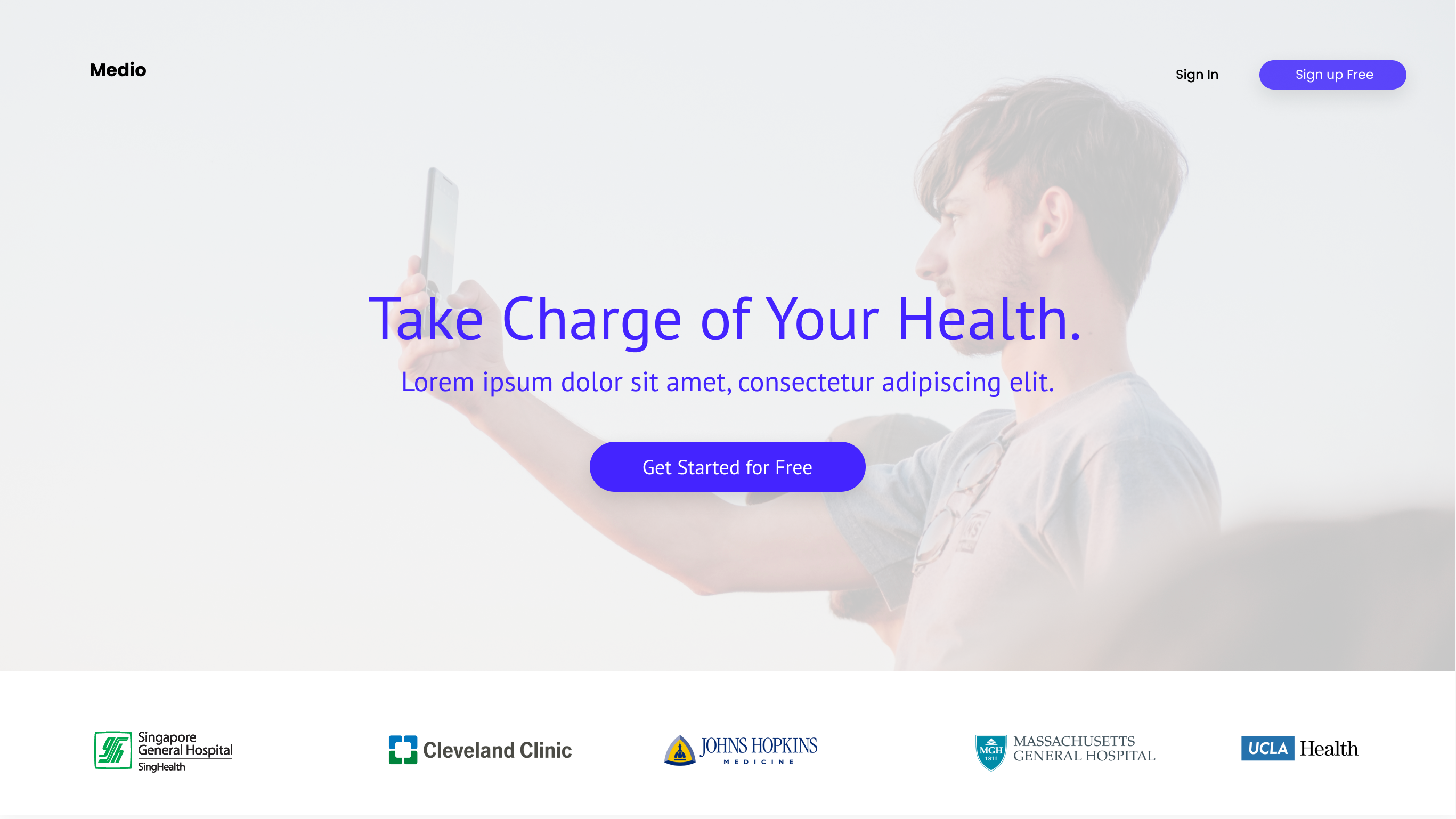
Medio asked the Five & Done team to audit their existing web application, COVID-19 Tracker. We provided UX suggestions and integrated these enhancements into a full redesign—all under an accelerated timeline.The goal of the redesign was to create something that is clean, professional, and usable, while targeting a broad audience.
Responsibilities
- Update sitemap and deliver wires
- Present one of two design concepts
- Based on chosen concept, collaborate with other designer to deliver final comps
- Work closely and be available for dev until site is launched
Step 1—Understand, define, and research
What’s a COVID-19 Tracker?
A questionnaire that’s validated with supporting vital sign measurements, taken using your device’s camera. Its purpose is to help users track their health and make informed decisions about seeking additional testing, care, or hospitalization.
A questionnaire that’s validated with supporting vital sign measurements, taken using your device’s camera. Its purpose is to help users track their health and make informed decisions about seeking additional testing, care, or hospitalization.
Audience
- Unfortunately, we had no user or performance data–the web app had yet to reach the hands of users
- Target audience—“cool and hip, but usable for grandma and grandpa”
Business Objectives
This project’s time line was very short—I’m talking one and a half months! So, I had to make short cuts when necessary.
- In addition to consumer use, Medio hopes the web app will evolve into an enterprise product
- Medio hopes to attract more investors
- Get something in the hands of users to start tracking KPIs such as: registrations, repeat visits, health history downloads, exit rates, bounce rates, and frequency of use
This project’s time line was very short—I’m talking one and a half months! So, I had to make short cuts when necessary.
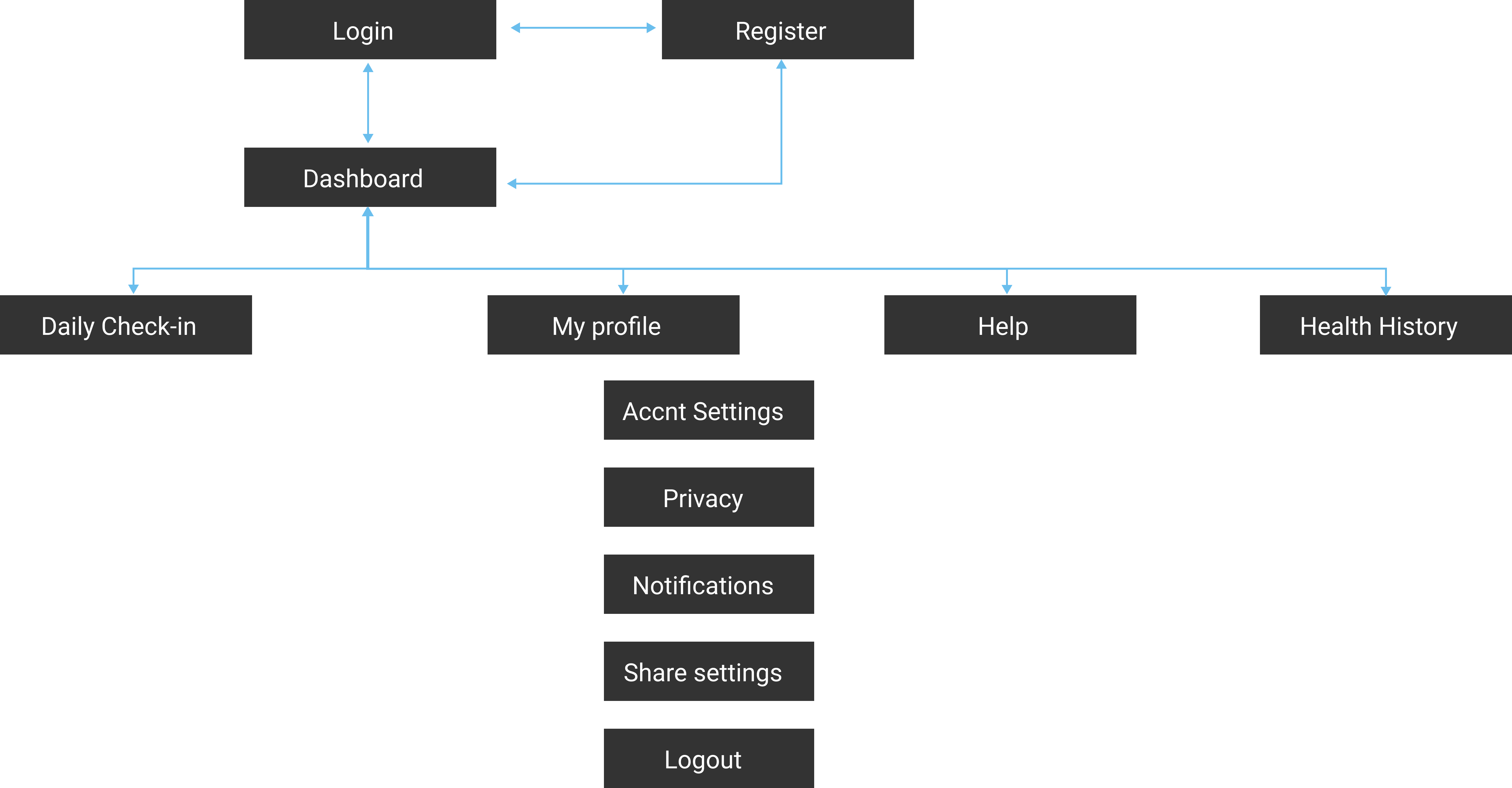
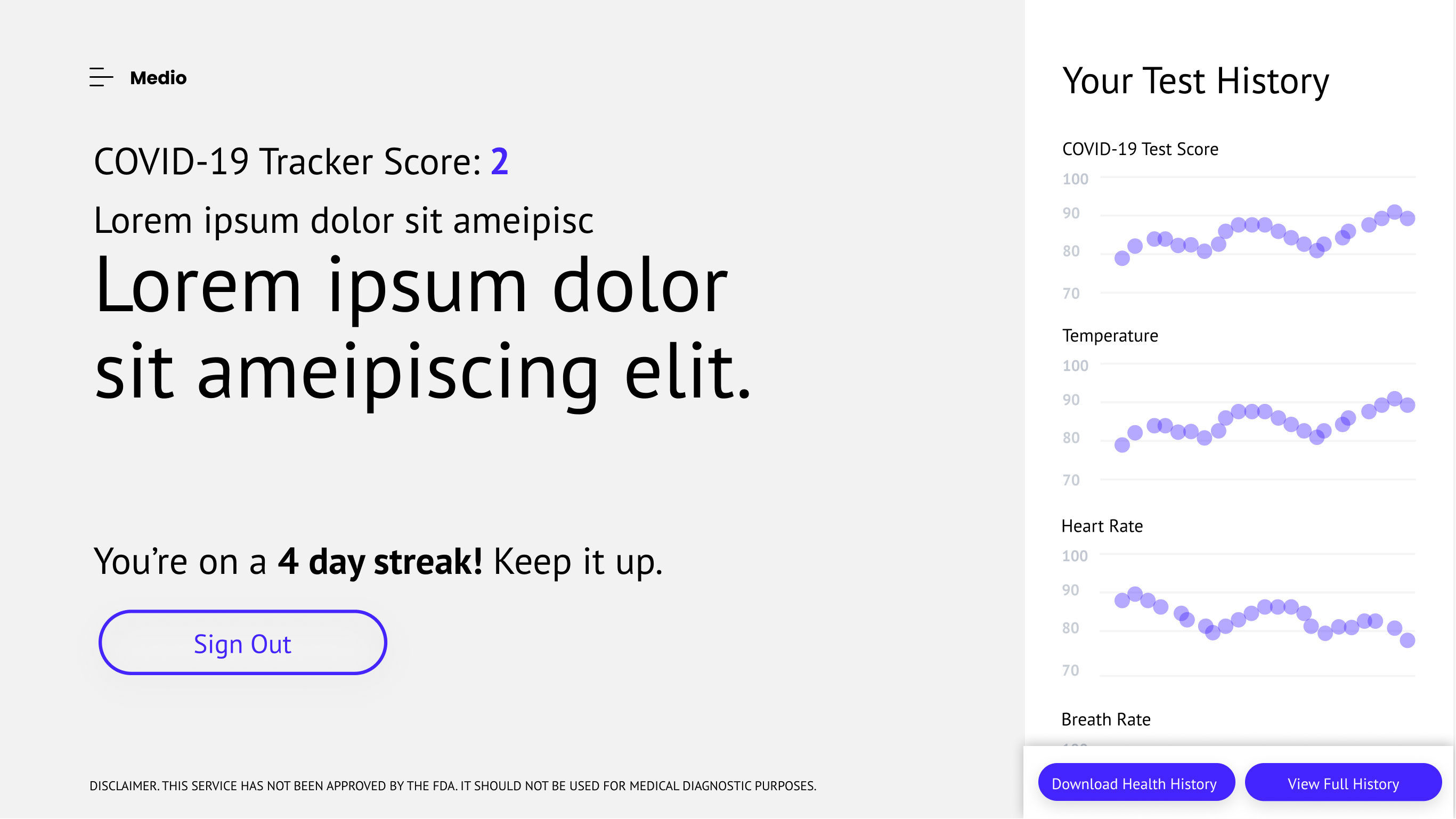
Right off the bat, I noticed there were some crucial pages missing. Specifically, a profile page—to allow users to make adjustments to their account information, a help center, and a health history page—to allow users to see their previously logged information.
Before
![]()

After
![]()
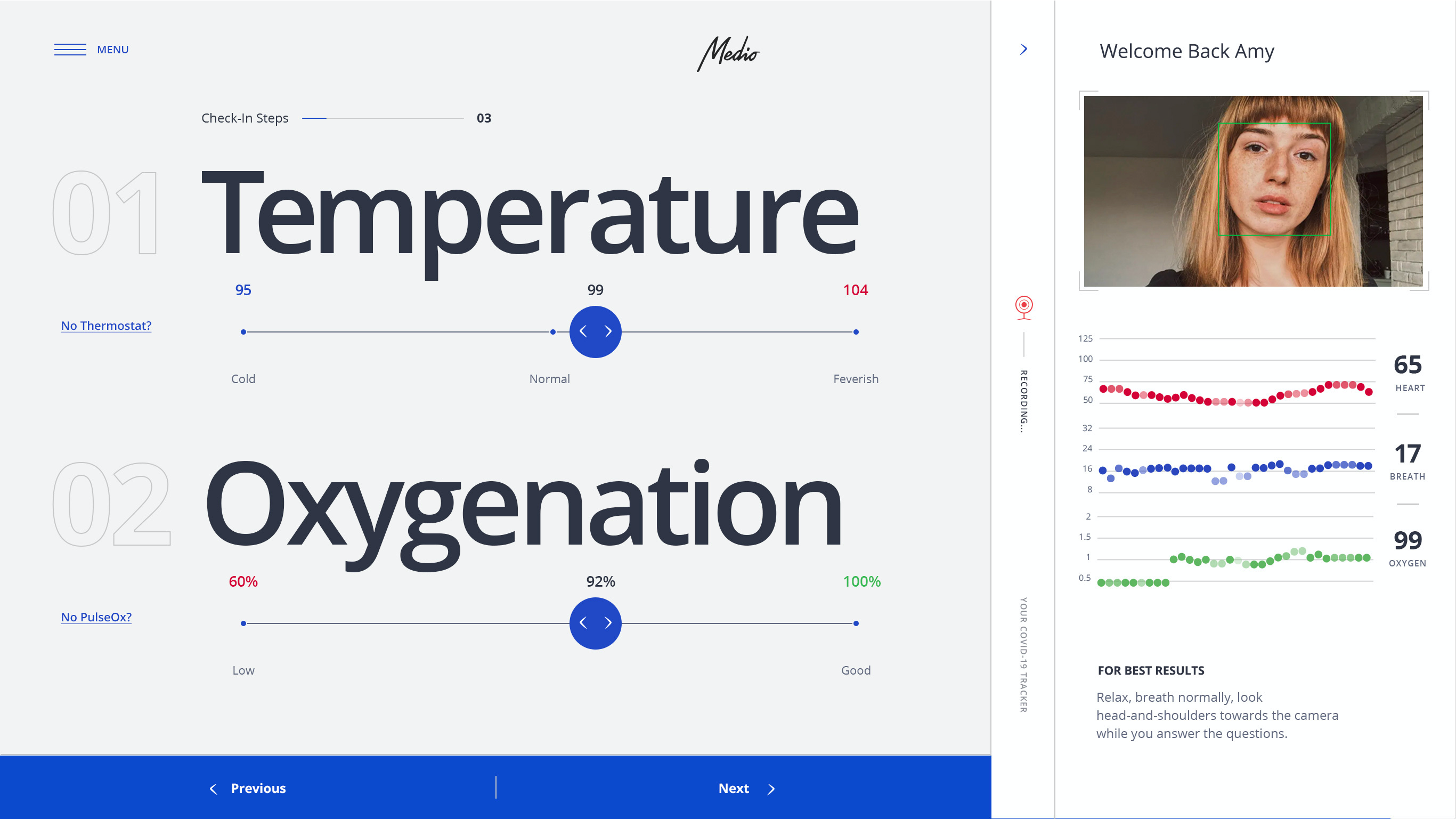
Due to the tight timeline, we skipped low-fidelity wires and immediately started working in a middle ground, somewhere between low and high fidelity—constantly checking in with our stakeholders and collecting feedback on both UX and UI.
“High-ish Fidelity” Wires—
“High-ish Fidelity” Wires—
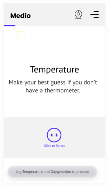
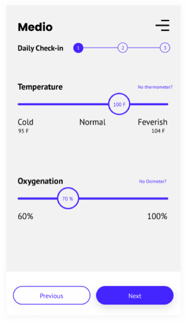
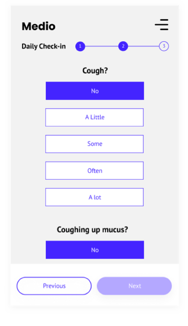
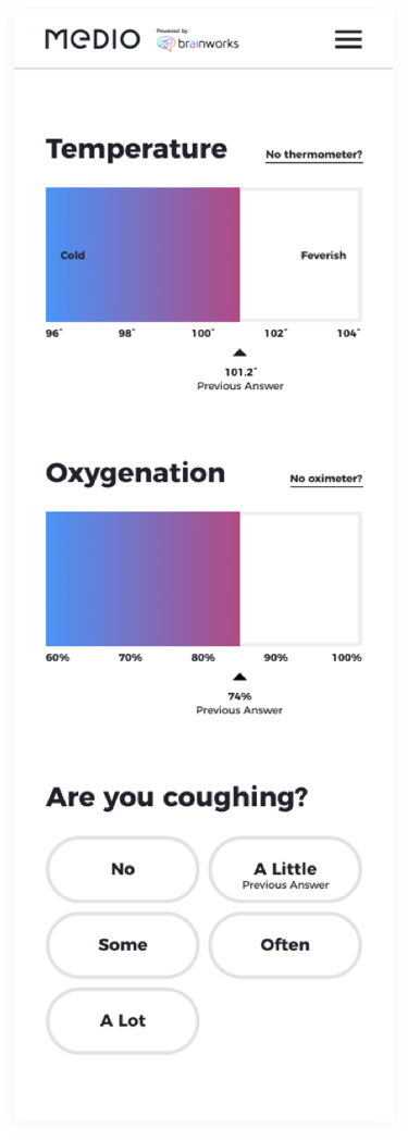
We put these wires through unmoderated online usability testing and found that the larger sliders were more efficient in completing tasks than the smaller sliders, and buttons were more efficient than either slider. We also discovered what would be our biggest hurdle—convincing users to grant camera access.
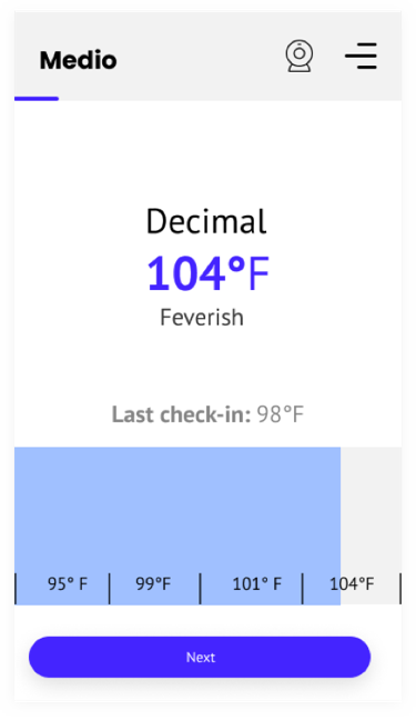
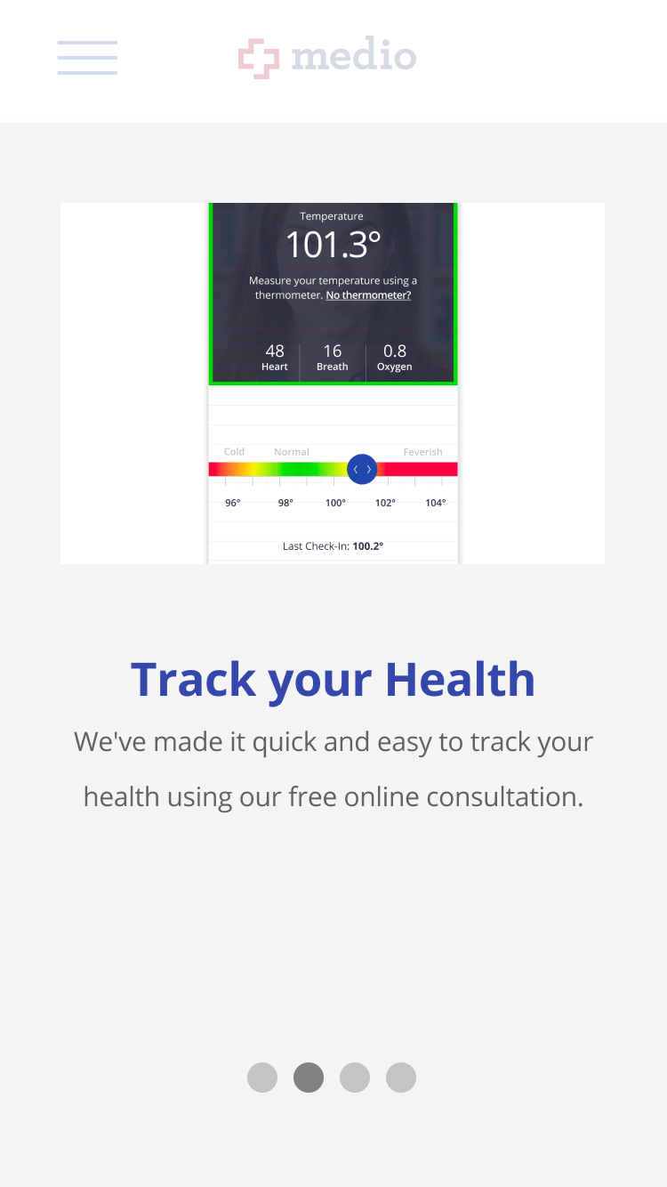
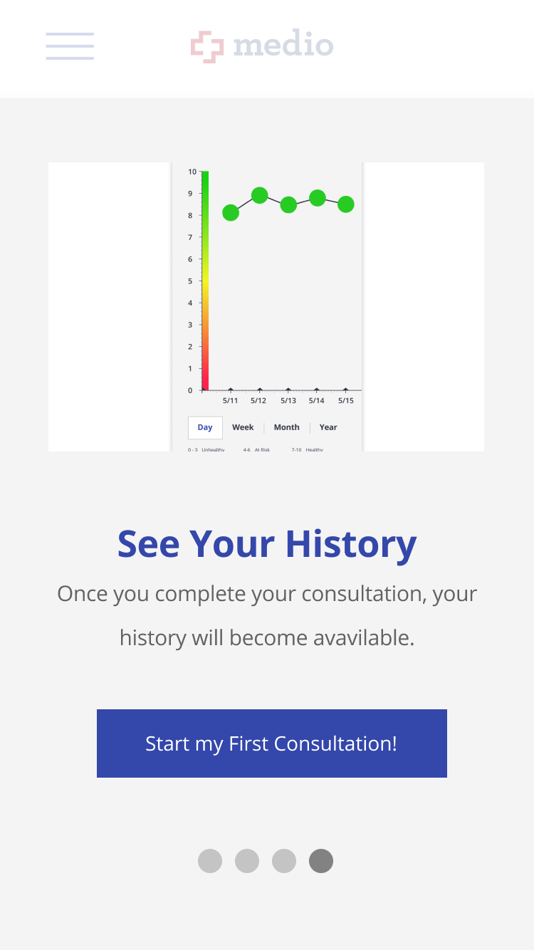
“Higher-Fidelity” Iterations—
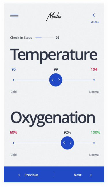
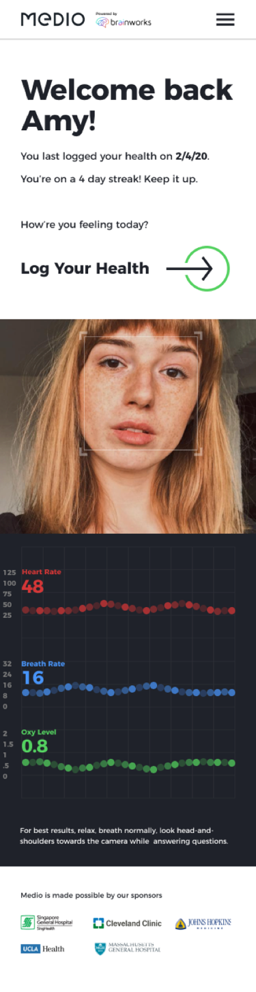
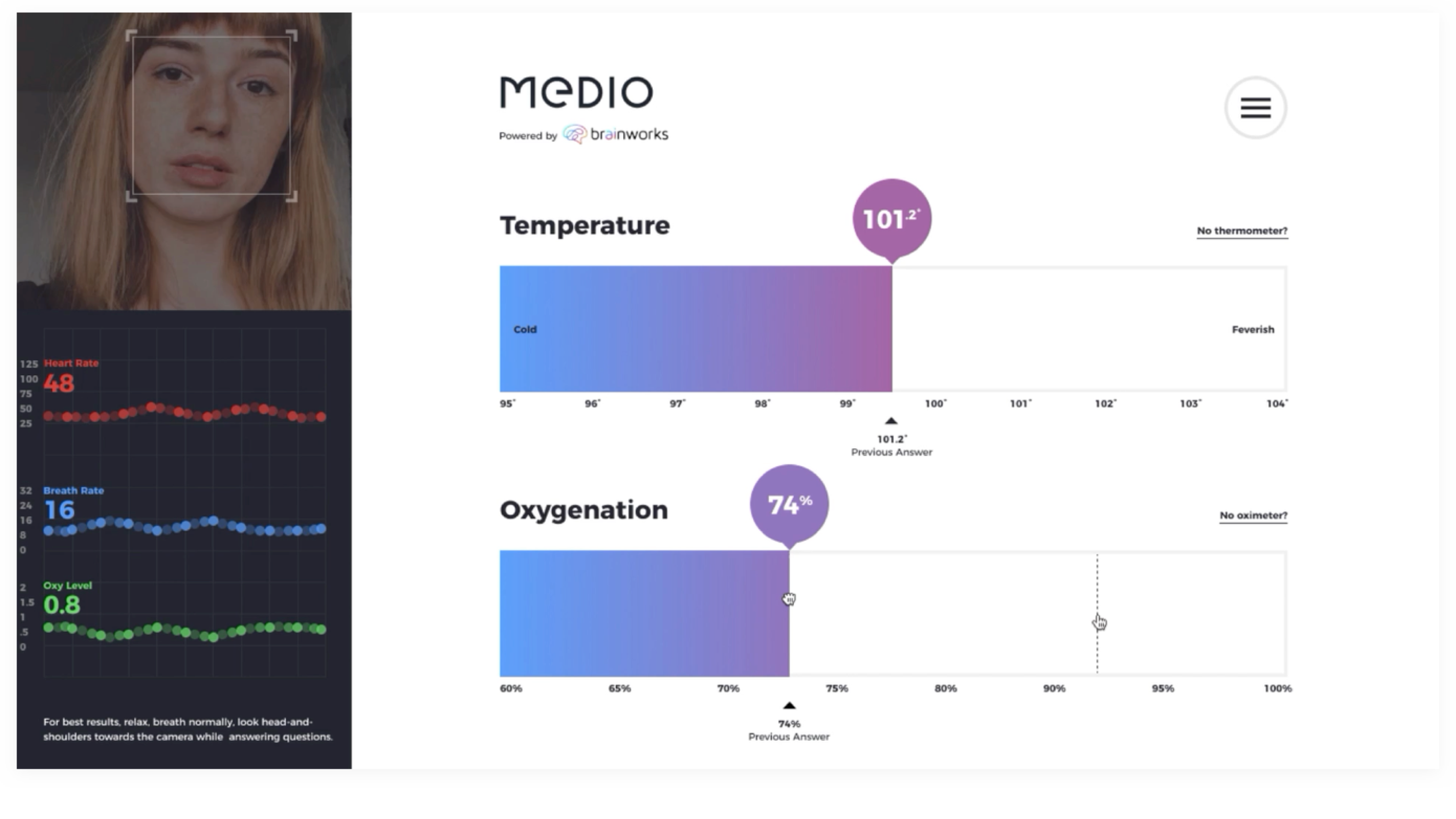
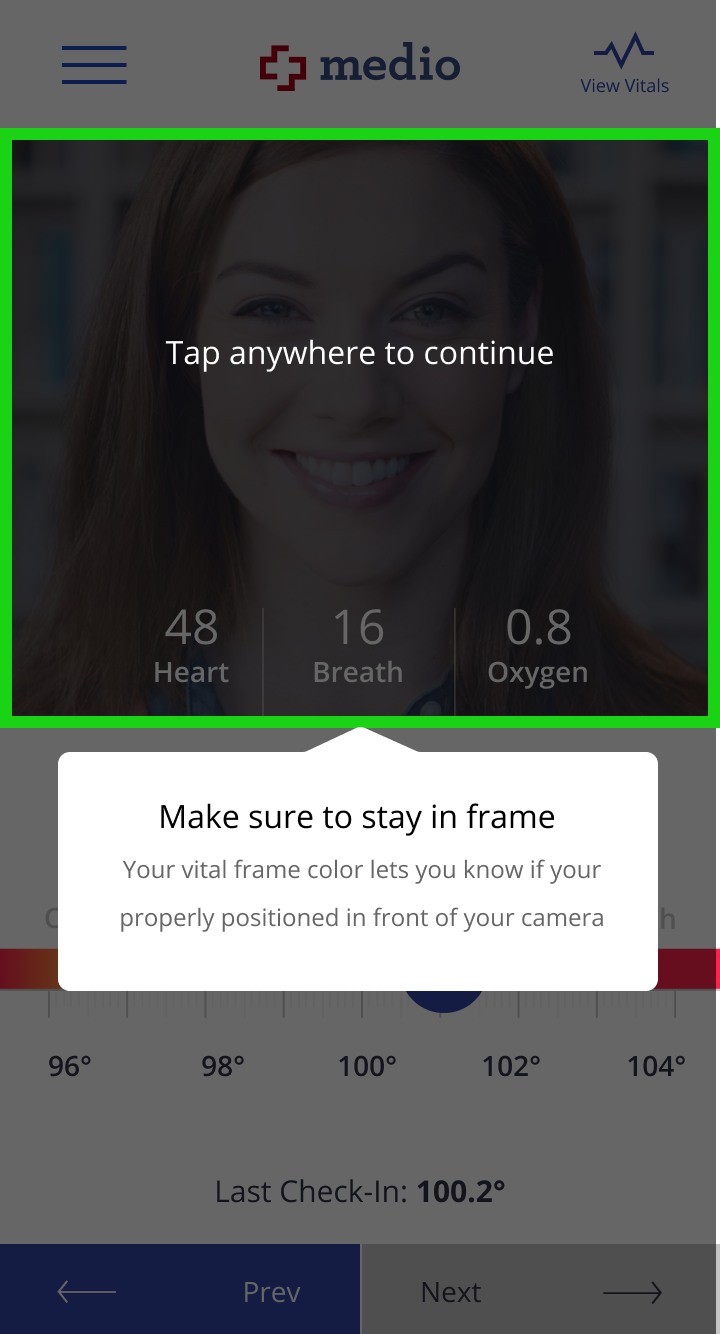
When I tested the “higher-fidelity” comps, testers were still not confidently granting camera access and there was still a lot of confusion when testers first logged in. I realized that I’d overlooked something incredibly crucial to the experience—onboarding. Below is the onboarding process I came up with.


Step 3—Implement and analyze
- Five and Done will continue to work with Medio to test before the official launch
- Medio is currently showing the prototype to potential investors
- Once the web app officially launches, we will track user demographics, as well as KPIs including: registrations, repeat visits, health history downloads, exit rates, bounces rates, and frequency of use
Reflections—
- Know when to be detailed, and when not to be
- Testing data alone can’t always convince decision makers