Here are two case studies. Please reach out if you’d like to know more about a specific project.
︎ Toyota Racing*
︎ Medio: Covid-19 Tracker
Toyota Racing
Toyota Racing (TR) asked the Five & Done team to redesign their website.The goal of the TR site redesign was to create a new look-and-feel that uses digital best practices, includes a mobile first experience, and houses the latest TR news and other lifestyle content.
Responsibilities
- Define UX/UI requirements through stakeholder interviews, user research, and analytics
- Create two design concepts in the context of homepage and article page
- Based on chosen concept, design CMS template
- Work closely and be available for dev until site is launched


Step 1—Understand, define, and research
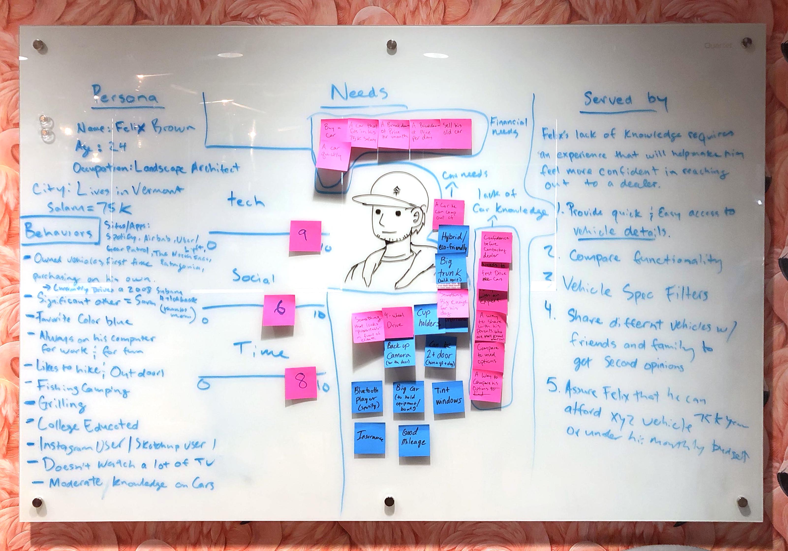
For this project I co-hosted stakeholder interviews, ran a persona workshop (photo below) with the TR team, conducted competitive analysis, interviewed users, and launched a survey to better understand Toyota Racing’s audience.
Why are we redesigning the site?
- Engage users with Toyota’s strong racing presence and history in order to direct traffic to Toyota’s consumer website
- Increase # of site visitors, site engagement, # of clicks for outbound links, and repeat visits
- The old TR site did not adhere to the latest Toyota Visual Identity System
- ADA requirements were not being met
Audience
- Mobile is 2/3 of TR’s current audience
- Speaking of current audience:
- Caucasian/male, 45-50 years
(this represented about 76% of TR’s audience at the time) - Target audience
- 16+ “anyone who can drive a car”
- Female
- Multicultural
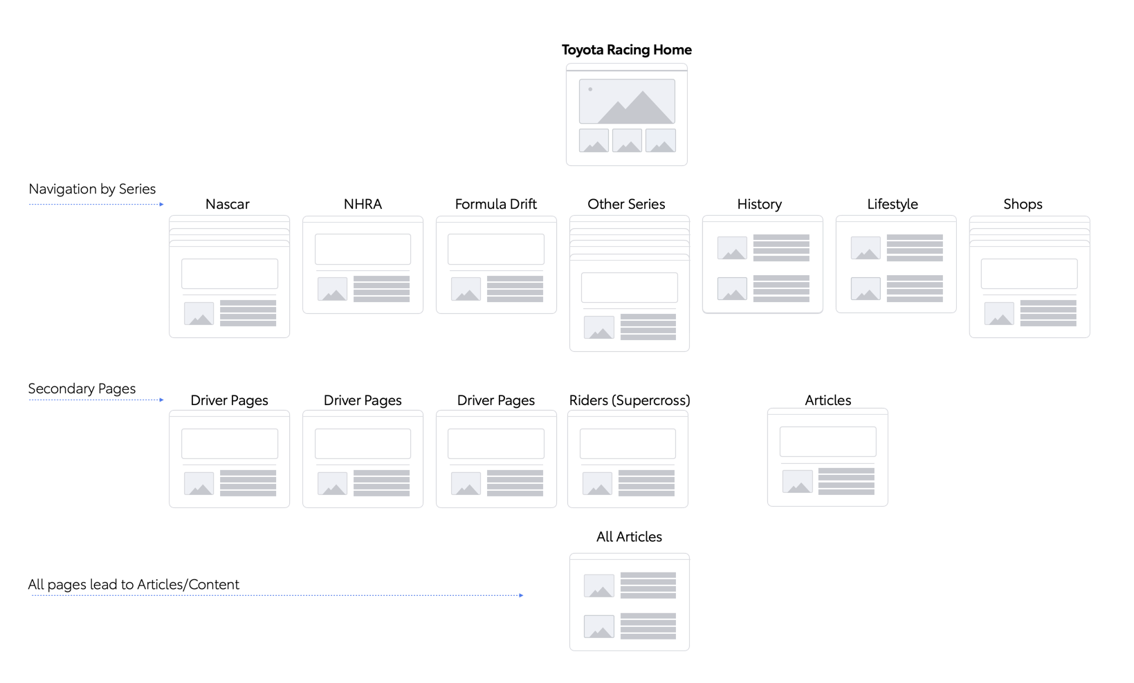
One of the survey’s key findings was that 81% of users claimed to be interested in only one specific series—the structure of the old site made finding information on a specific series a tedious process. Drivers, schedules, and news were all mixed together.
Immediately below is the final, approved site map, in which I adjusted the information architecture to better suit users interested in specific series.
Step 2—Ideate and design
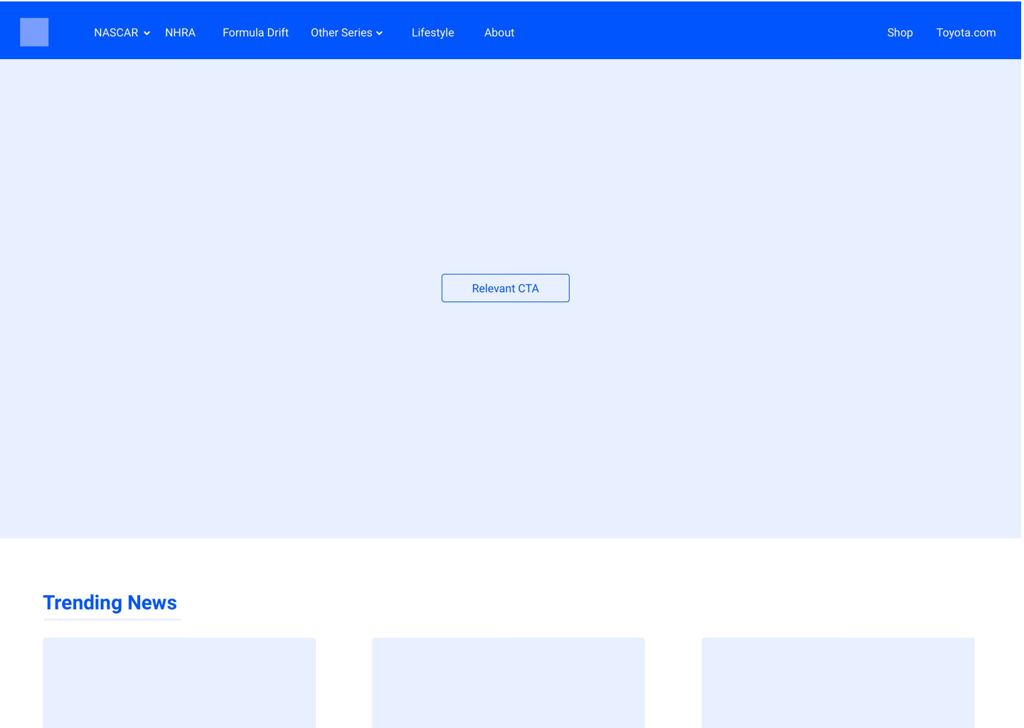
I presented two design directions (below) to the TR team and they had trouble deciding which one they liked most. So, I recommended we put the designs through observational usability testing to gather impressions.
Direction 1—

Direction 2—
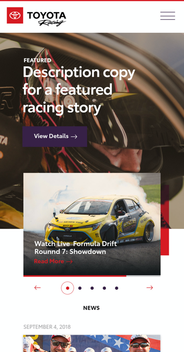


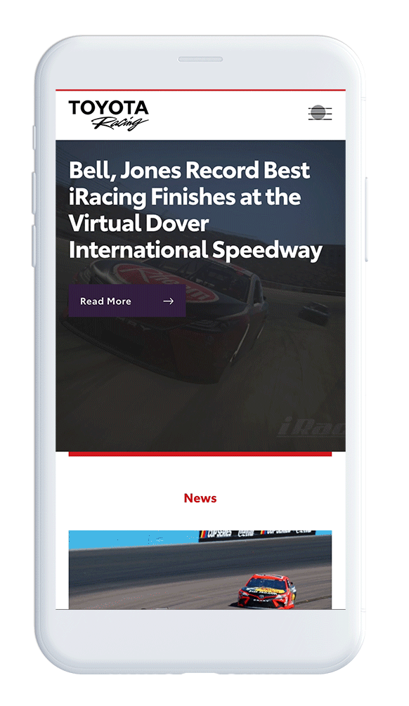
Although I was more excited about design direction 1, it tested poorly. Testers found the home screen confusing and often retreated to the hamburger menu—the only UX element with which they were instantly familiar. TR decided to move forward with design direction 2 and further refinements were made as we eased into the next step.
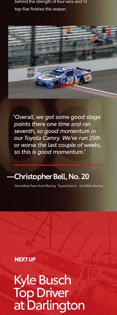
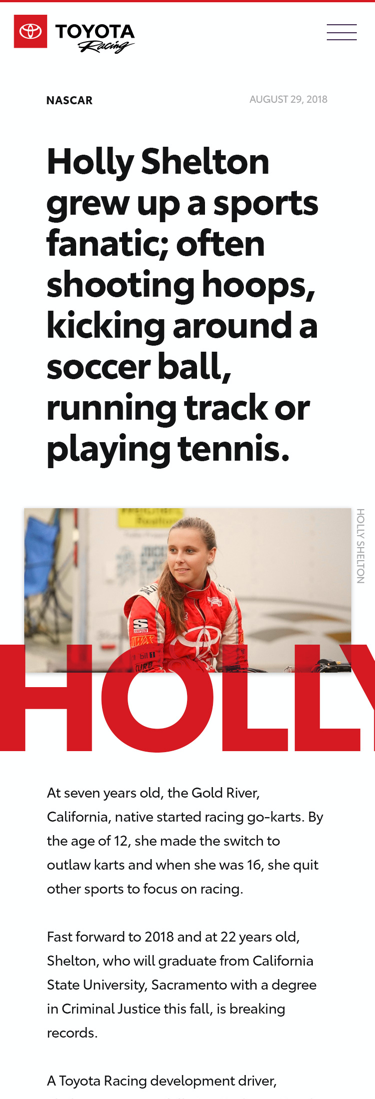
Step 3—Implement and analyze
I continued to refine the chosen design and got it ready to hand off for development. Working closely with the developers, QA-ing both function and visual, we launched the new TR site.


Since launching the new TR site
- # of site visitors increased from 454k to 538k
- Bounce rate decreased by 12%
- Average time spent per visit increased from 36 sec to 61 sec
- Repeat visits increased by 8%
- Efficiency continues to increase as we work with the TR team to complete initiatives at a faster-than-ever rate
- Awarded Toyota Certified Used Vehicle redesign contract
Reflections–
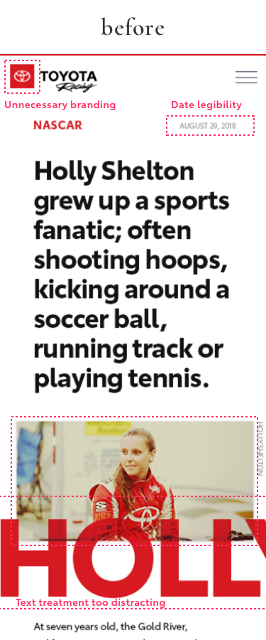
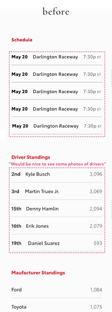
There are always opportunities to improve the experience. Here are a few examples that surfaced post launch. The team and I are working hard to address some of these observations.
- Social media outbound link clicks were significantly lower than all other outbound link clicks
- Traffic to Driver Pages shot up, but pages are currently difficult to find
- Know where to invest time in interactions